So I'm taking a course dealing with developing more modern literature, and one of our projects is to create a graphic novel mock-up, and so what's below is what I got. Would anyone change anything in it or have any recommendations?
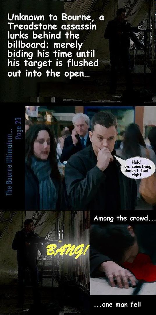
The transition between the "drawn" looking images and the photo-realistic is a bit off putting to my eye. Additionally, if you can size the text blocks down and find a more suitable font (one which resembles comic-book lettering) I think that would help sell it.
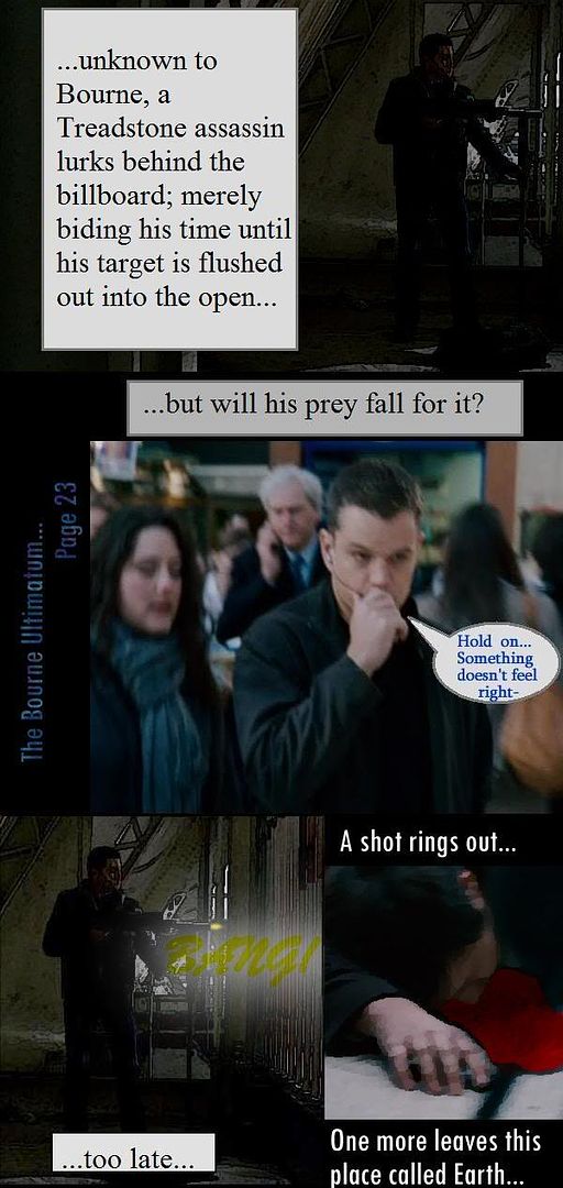
I did not like the big white block of text. I must confess that I do not read many graphic novels so it may be the norm for them but, personally, I would have preferred your descriptions be in a more comic book lettering style that overlaps the graphic to show more of it...so you don't have a quarter of your page being a white field with huge text.
The "Bang" graphic is difficult to see. At first, I thought it said "zing".
I also did not like the placement of "A shot rings out" and "...to late...".. it just seemed "off" to me.
But it sounds like your class is more about the story-telling angle than the actual graphic. If this is just an advertisement page to 'hook' a reader, I like the ambiguity. If it is supposed to be the actual page of a graphic novel, I would have liked to see more descriptive details (shorten the text to fit more in your boxes if the white fields are all you have to work with). If those white fields were actually transparent fields with the text contrasting the artwork so it's visible, I would think the 'feel' of the novel would be better served.
When I say more descriptive details (I mean of the assassin, his hiding place, the crowd Bourne is traveling in, etc..)
I have to admit Om, I dislike using the text boxes near the bottom, but I'm having trouble figuring out how to fit the text given the shot from the movie (all of these pictures are modified shots out of the movie)...
See the yellowish box at the bottom? That's what I'm trying to point you in the direction of and, I think, so is Om. In most graphic trades text is kept on a much smaller scale then you have currently and boxed in contrasting colors (black on yellow, gray on white etc) and should never steal focus from the image(s) to which it is connected.
Also, you can do a google search for "comic fonts" and find a whole bunch of options which are a million times better then any word/image manipulation software comes with stock.
I think your text is still way too big but you're moving in the right direction there! Your graphic novel should follow the comic book format of text as Beff illustrated. You can still put out a story but, imho, text is 50% of story and graphics the other 50%. They should compliment one another, not outshine each other.